

A usability and visual audit of the existing Nat Geo Kids website revealed several key pain points:
What is National Geographic trying to achieve here?
These issues disrupted flow, reduced engagement, and diluted the educational impact of the site.
National Geographic Kids is a resource for children aged 6–14, designed to spark curiosity and inspire a love of learning about the world—especially through science, nature, animals, and history.
The platform should allow kids to:
The redesign aimed to realign the website with this purpose.
How might we redesign the National Geographic Kids website to:
I conducted informal usability testing, competitive analysis, and secondary research focused on children aged 6–14 and their digital learning habits. Key insights included:
Meet Morgan, a 9-year old who likes: weird or gross animal facts, frogs, sharks, and anything slightly scary, bright visuals and playful interactions.
Dislikes:
Goals & Motivations:

☆ Establishing Core Features
Based on research, I restructured the site around four core content pillars:
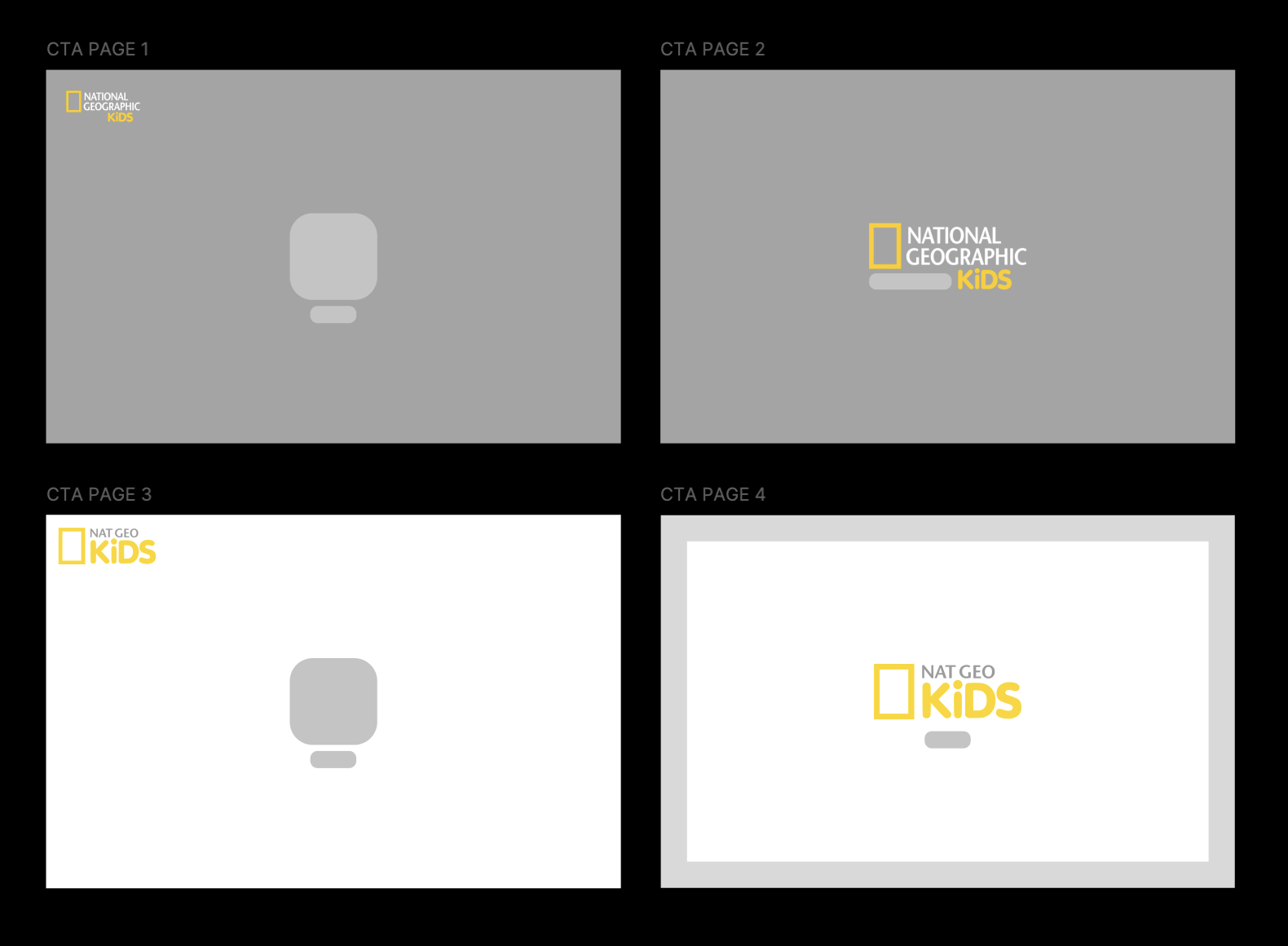
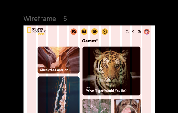
☆ Wireframing & Prototyping
I began with low-fidelity wireframes to establish layout clarity and hierarchy. I decided to use columns to ensure picture-perfect spacing. Key design decisions included:
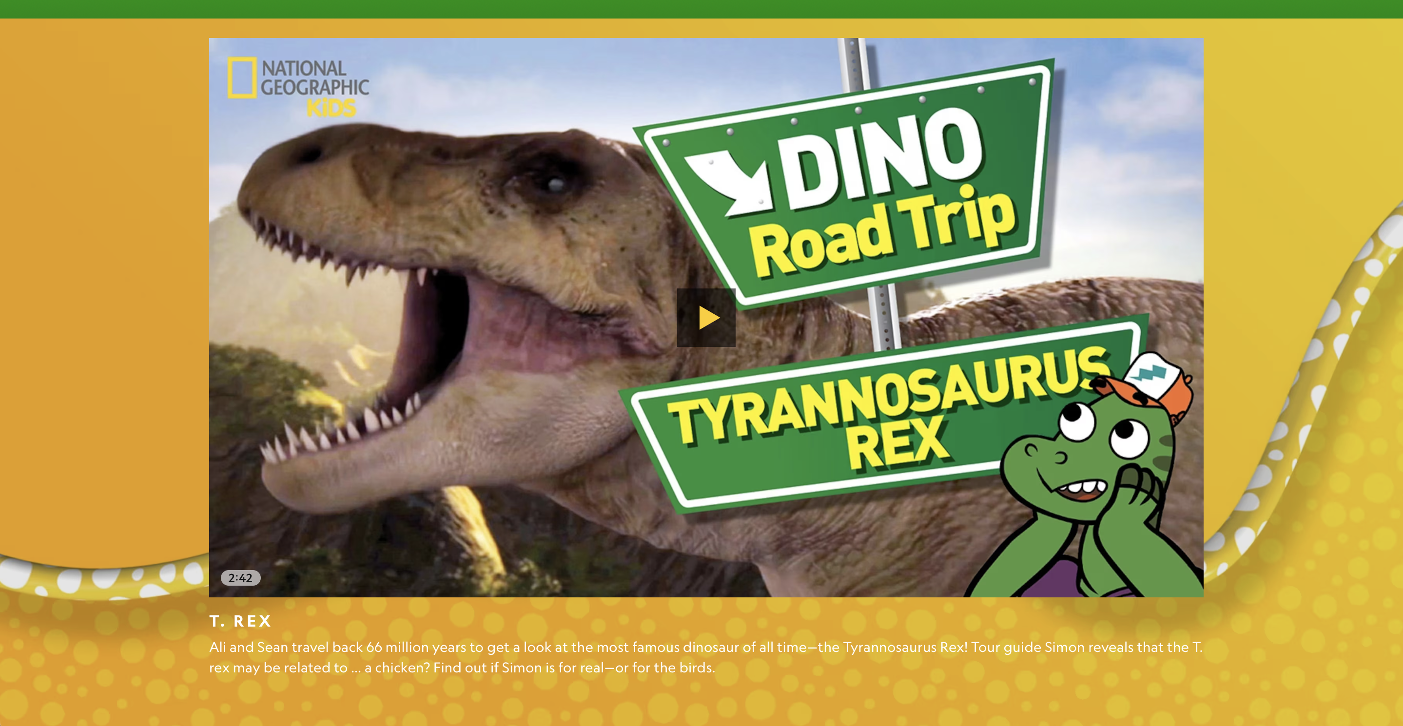
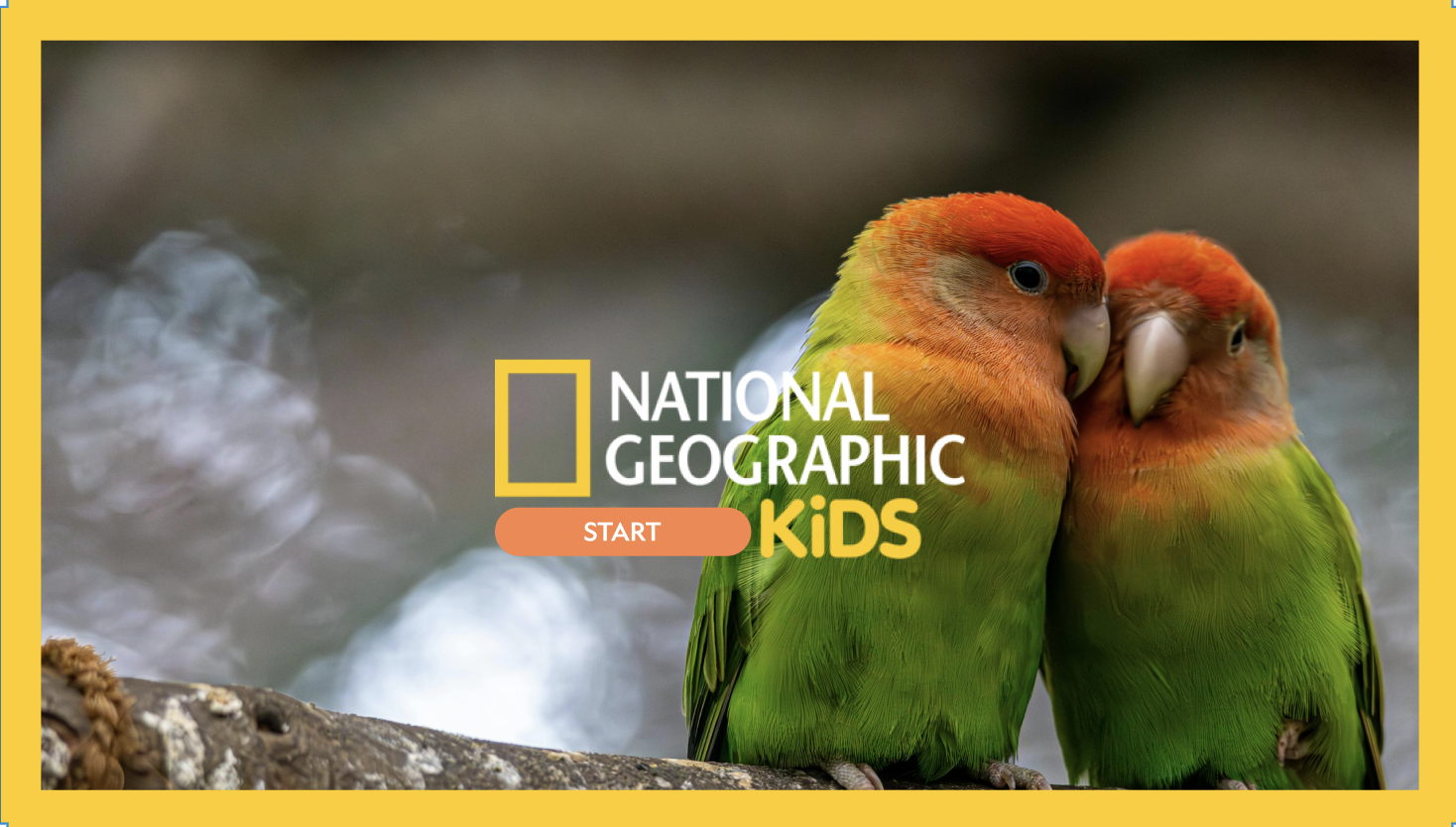
The redesigned National Geographic Kids website transforms learning into an interactive adventure:
What I Learned:
Next Steps:
This redesign reinforced the importance of designing with empathy—especially for younger users. By prioritizing curiosity, clarity, and play, the National Geographic Kids website becomes not just educational, but genuinely exciting to explore.